

How a Small Design Change Generated 150+ New Leads for Rivy, Without Touching a Single Line of Backend Code
The Problem Nobody Was Talking About
At Rivy, our solar calculator is one of the first touchpoints a potential customer has with us. Someone hears about solar financing, gets curious, opens the calculator, plays with a few numbers, sees what solar could look like for their home or business and then, in a lot of cases, leaves.
They leave with the information they came for. But we leave with nothing.
Literally nothing. The calculator, as it existed, was a pure utility, a self-contained tool that let anyone estimate their solar costs and savings without ever telling us who they were. No phone number collected. No contact detail. No way to follow up. It wasn't a leaky funnel; it wasn't a funnel at all. A genuinely interested prospect could walk in, explore, get real value, and walk right back out completely anonymous and unless they independently decided to reach out to us, that interest simply evaporated. For a fintech and solar financing company where every lead matters, that's not a small gap. That's the top of the funnel not existing.
The calculator was doing its job as a utility. It had never been designed to do a job as a funnel.
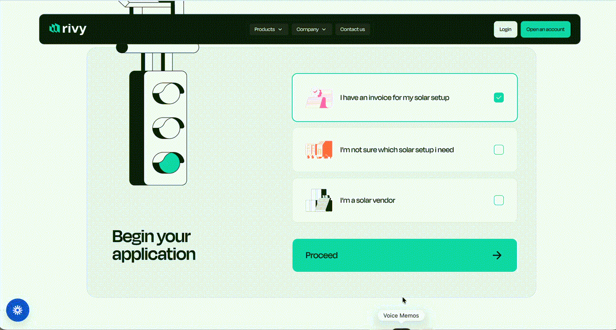
The Insight: A Utility Tool Is a Lead-Gen Tool Waiting to Happen
The instinct in a lot of product teams, when there's no lead capture at all, is to bolt something on top of the existing experience, a pop-up, a retargeting campaign, an entirely separate lead form living outside the product. More engineering, more scope, more time, and often a worse experience, because now the user is dealing with two disconnected things instead of one coherent one.
We asked a simpler question instead: what if the tool we already have, the one people are already choosing to open because they're curious about solar for themselves is the best lead-capture surface we could build, if we just design it that way?
We didn't need to manufacture interest with a new campaign or a new channel. We needed to capture the interest that was already walking through the door and doing nothing with it.
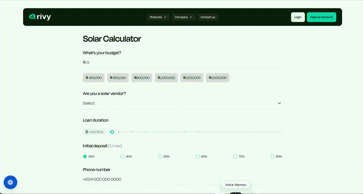
So the initiative became: turn the calculator itself into a lead-gen tool. We introduced phone number and budget collection ahead of the calculator experience, a step that simply didn't exist before. Users now share a bit about themselves, their phone number and roughly what they're looking to spend on solar before they get to interact with the calculator and see their personalized numbers.
It's a single new screen added to an existing flow. No new campaigns, no new acquisition channel, no separate system to maintain. Just a deliberate decision to have the product ask for something it had never asked for before, at the moment it had the most reason to.
Why This Works: The Psychology of Sequencing
This wasn't a guess. It's grounded in a simple, well-understood principle of user behavior: people are far more willing to give something up when they're anticipating a reward than after they've already received it.
Before someone sees their personalized solar estimate, there's anticipation curiosity about what the number will be, what it means for them, whether solar is actually within reach. That anticipation is leverage. It's the moment a small ask (a phone number, a budget range) feels like a fair trade for something valuable about to be revealed.
If we had waited and asked after the estimate was already shown, that leverage would be gone. The value would already be delivered, and the same ask would feel like friction standing between the user and leaving. Placing the ask at the front at the point of highest anticipation, rather than after the fact was the deliberate choice that made the difference between a tool that captured nothing and one that captured a real, working list of interested leads.
We also weren't asking for anything invasive, a phone number and a budget band, both directly relevant to the thing the user was already there to explore. It didn't feel like a form. It felt like the natural first step of a conversation the user was already about to have with us.
The Result
The change was scoped, designed, and shipped as a lean two-person effort — myself, as senior product designer leading the initiative, working alongside a second product designer on the team to move it from insight to shipped experience.
The outcome: approximately 150 new leads generated monthly, up from a baseline of zero because before this change, the calculator captured zero contact information from any user, no matter how many people used it. This wasn't an optimization of an existing lead flow. It was the creation of one, inside a tool that had never had one, with no new backend logic and no new infrastructure beyond adding the fields to the existing experience.
For context, that's 150 people who are now in our funnel, reachable, follow-uppable, convertible who under the old flow would have used the calculator, gotten their answer, and left without a trace.
The Bigger Lesson
It's tempting, in product and design work, to equate impact with scale, the bigger the build, the bigger the win. This project is a reminder that some of the highest-leverage moves available to a team aren't about building more. They're about understanding the moment, recognizing exactly where, in a user's journey, their willingness to engage is highest, and designing around that moment instead of around convenience for the build.
A few things I'm taking forward from this:
- Audit sequence before you audit surface. Before redesigning what a screen looks like, it's worth asking what order things happen in, and why. Sometimes the highest-leverage fix isn't visual at all.
- Value-first asks convert better than post-value asks. If you need something from a user, the best time to ask is when they still want something from you.
- Small, well-reasoned design changes can outperform large builds. This wasn't a quarter-long project. It was a hypothesis, a mockup, a conversation with engineering about feasibility, and a ship, and it moved a real, measurable number.
For a solar financing platform built to serve customers across a wide spectrum of digital literacy and comfort, meeting people at the moment they're most engaged instead of asking things of them after their curiosity is already satisfied is a principle we'll be applying well beyond the calculator.